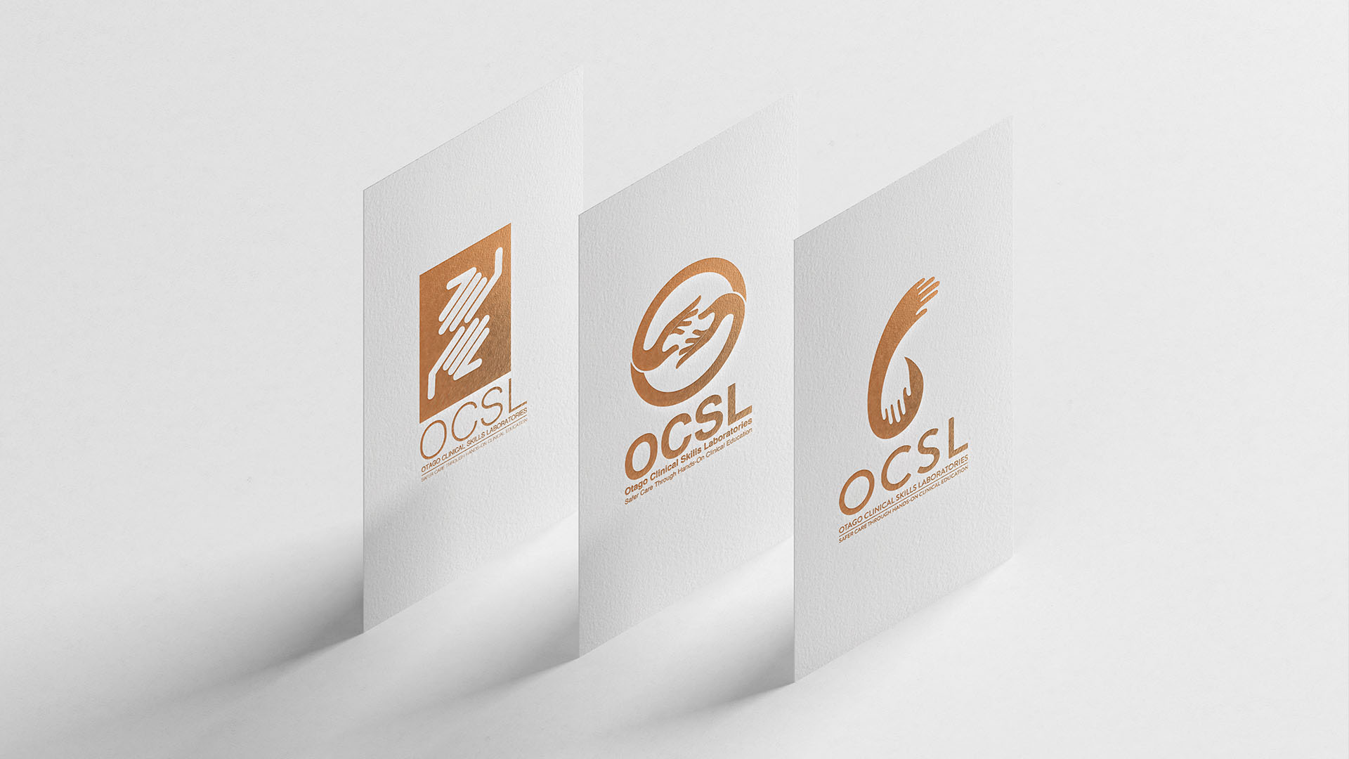
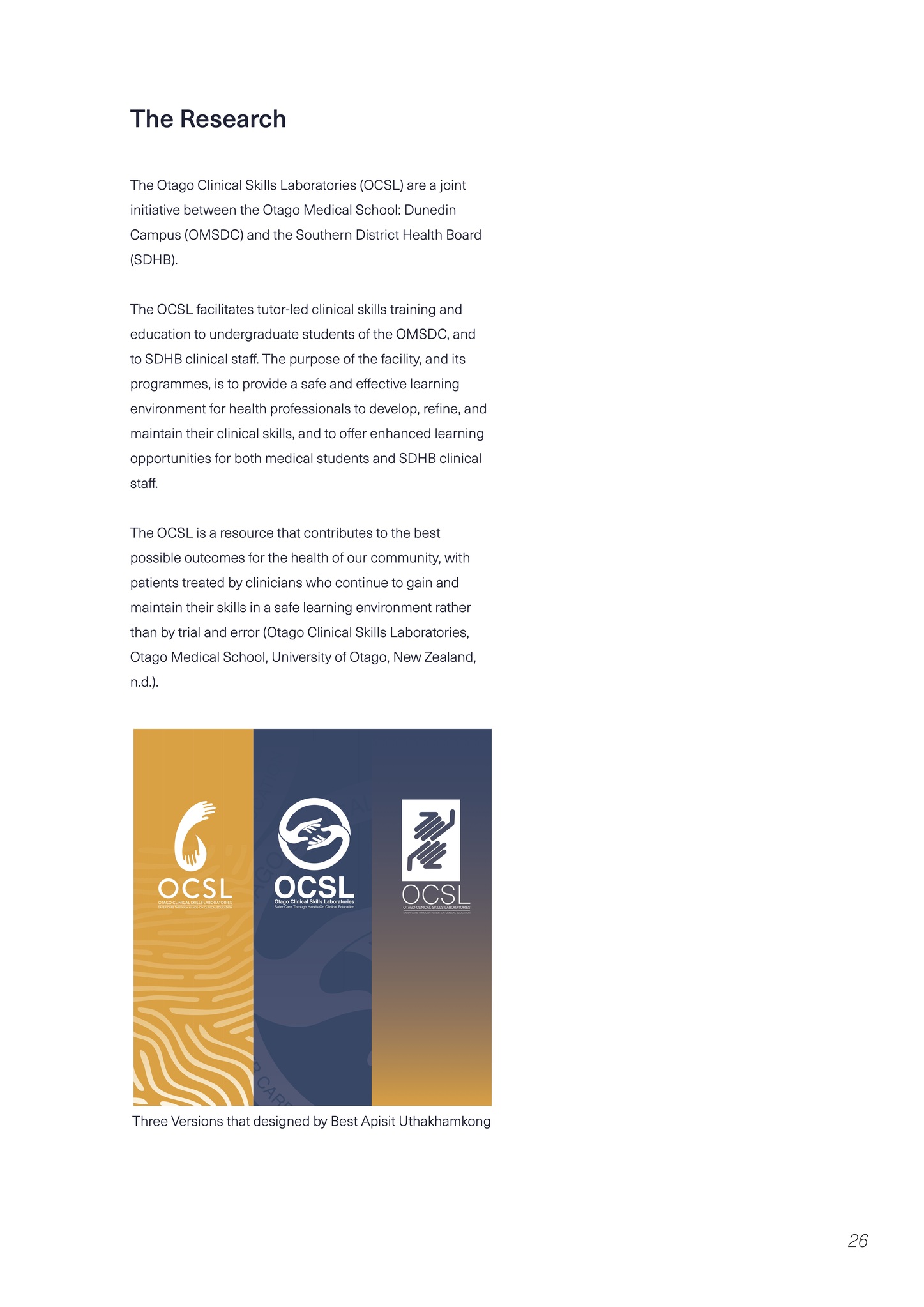
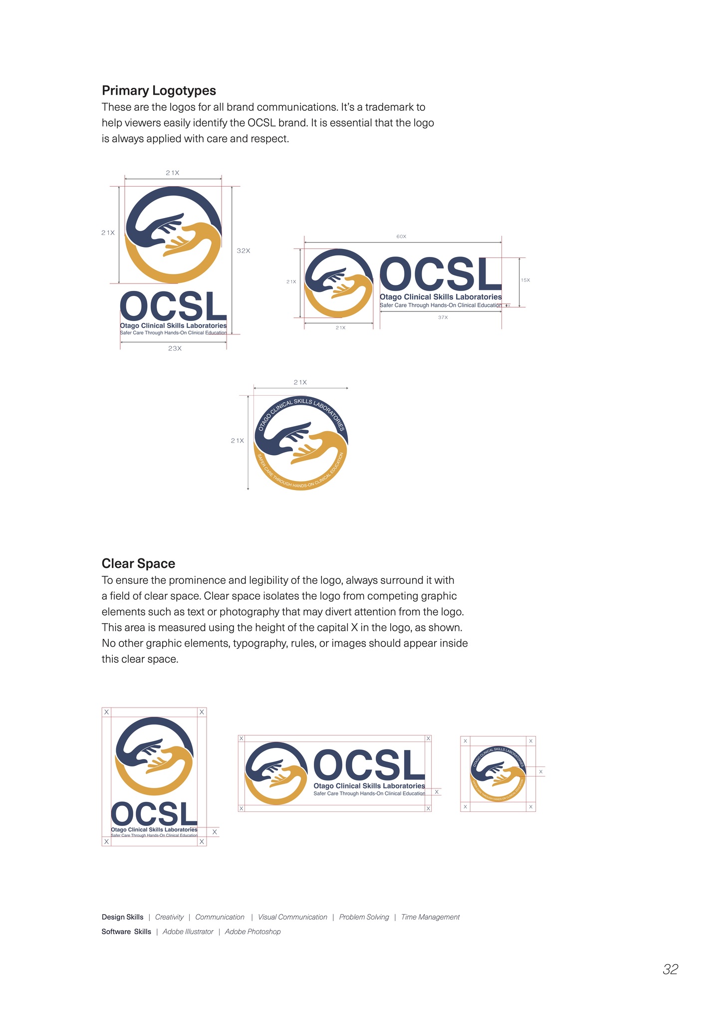
I designed the updated logos and brands for Otago Clinical Skills Laboratory. The logo and branding were developed from the old version and I designed three options for the OCSL.
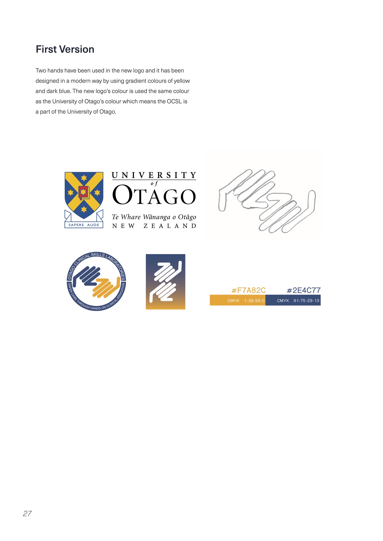
The Frist Version
Two hands have been used in the new logo and it has been designed in a modern way by using gradient colours of yellow and dark blue. The new logo’s colour is used the same colour as the University of Otago’s colour which means the OCSL is a part of the University of Otago.
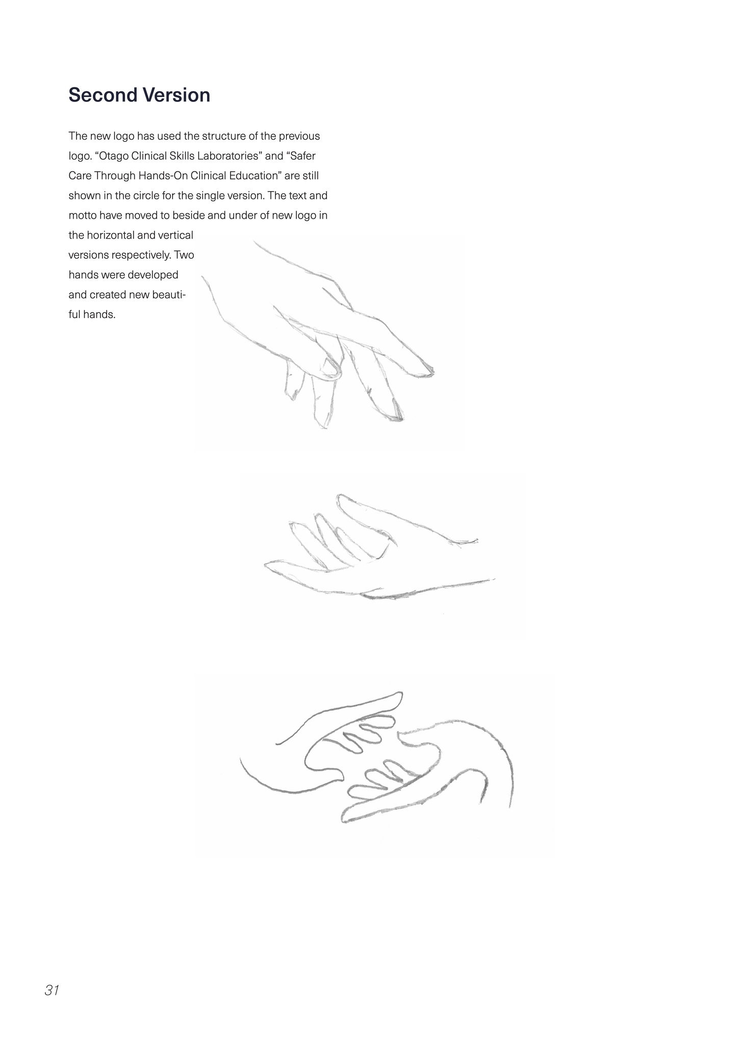
The Second Version
The new logo has used the structure of the previous logo. “Otago Clinical Skills Laboratories” and “Safer Care Through Hands-On Clinical Education” are still shown in the circle for the single version. The text and motto have moved to beside and under of new logo in the horizontal and vertical versions respectively. Two hands were developed and created new beautiful hands.
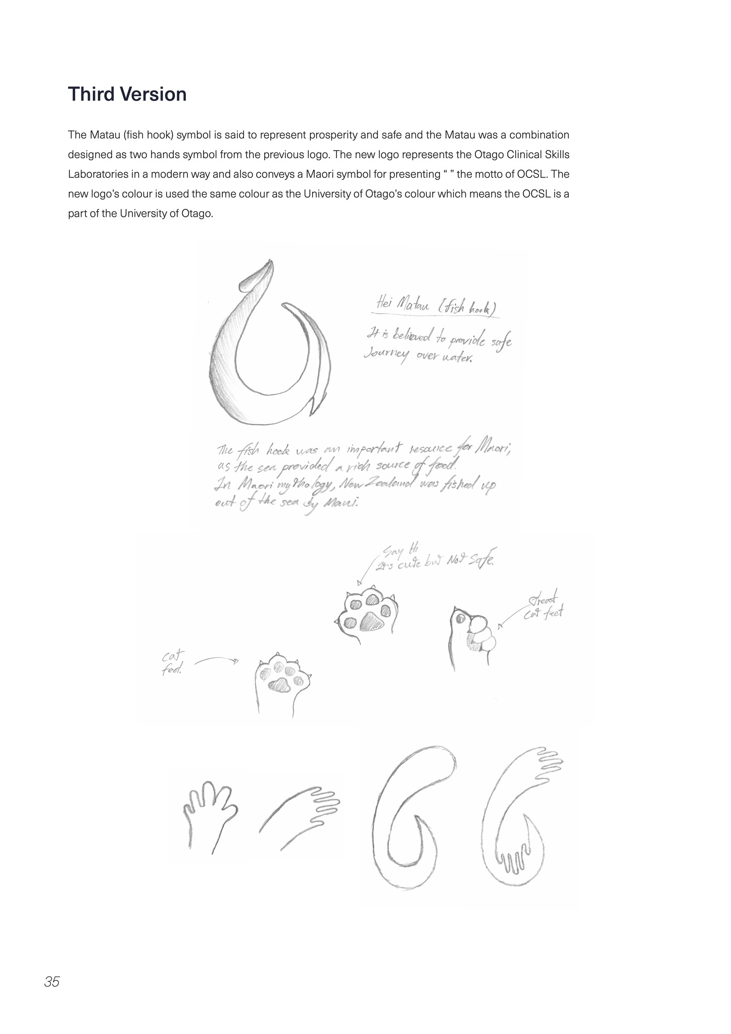
The Thrid Version
The Matau (fish hook) symbol is said to represent prosperity and safe and the Matau was a combination designed as two hands symbol from the previous logo. The new logo represents the Otago Clinical Skills Laboratories in a modern way and also conveys a Maori symbol for presenting “ ” the motto of OCSL. The new logo’s colour is used the same colour as the University of Otago’s colour which means the OCSL is a part of the University of Otago.